
Why Two Spectrograms of the Same Audio Can Look Different
Learn why window size, scale, normalization, color, and display dimensions can change a spectrogram, plus a repeatable method for comparing the same audio fairly.
Compare the settings, then listen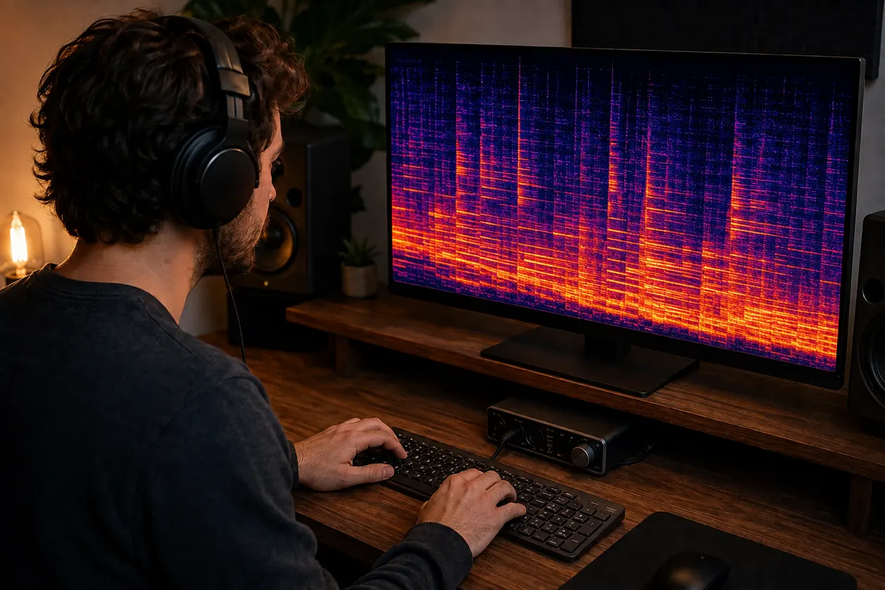
Two spectrograms of the same audio can look different because a spectrogram is not a photograph of sound. It is a calculation followed by a visual rendering, and both stages require choices. Change the analysis window, frequency scale, decibel reference, color range, image width, or interpolation and the picture changes even when every audio sample stays the same.
The practical action is to compare settings before comparing colors. Use the same file and passage, match the analysis and display controls, export both images at the same dimensions, and then listen to the exact moment that drew your attention. The limit is equally important: matching pictures do not certify quality, and different pictures do not automatically reveal damage.
I start with the ears because the screen has no idea which part of the song matters to you. I describe the sound first, mark its time, and only then use a spectrogram to make the check repeatable.
Window and resolution settings
Most audio spectrograms use a short-time Fourier transform, usually shortened to STFT. The software divides the signal into overlapping slices, applies a window to each slice, and calculates how much energy falls into each frequency bin. SciPy’s ShortTimeFFT documentation makes these controls explicit: the window, hop between slices, sample rate, FFT mode, FFT length, and scaling are all parameters of the result.
Window length creates the most visible trade-off. A longer window separates nearby steady frequencies more clearly, so a narrow whistle or sustained harmonic may look thinner. That same setting spreads a quick click, consonant, or drum attack across more time. A shorter window places fast events more precisely but merges nearby frequencies into broader bands. Neither result is a mistake. Each answers a slightly different question.
The window shape matters too. Hann, Hamming, Blackman, and other windows control how energy from one frequency spreads into neighboring bins. Two tools can use the same number of samples yet draw different skirts around a tone because their default window functions differ. A label such as “2048-point FFT” is therefore not a complete comparison record.
Hop size, often exposed as overlap, determines how far the window moves before the next calculation. More overlap creates more time columns and can make motion look smoother. Less overlap produces fewer snapshots and may make a short event look blockier or shift its most vivid column. Zero padding can add displayed frequency samples between the underlying measurements, but it does not remove the time-versus-frequency trade-off created by the window.
Sample rate and channel handling belong in this group as well. A viewer may analyze the left channel, right channel, a mono sum, or separate stereo channels. It may resample before analysis. If one render uses the left channel and another combines both channels, they are not measuring the same signal path even when both came from one file.
When you use the browser spectrogram generator, it creates a consistent PNG from a local MP3 or WAV in browser memory. That makes it useful for repeating a view in one tool. When comparing its output with another viewer, write down the other tool’s window, overlap, frequency limit, channel mode, and scale instead of assuming the defaults match.
Scale and color mapping
The vertical axis can be linear, logarithmic, Mel, Bark, or another scale. A linear scale gives equal screen space to equal frequency differences. A logarithmic scale gives equal space to frequency ratios, which expands lower musical regions and compresses the upper range. Audacity exposes several scale options, so one file can look stretched at the bottom in one view and crowded there in another.
The measured frequency content has not moved. The scale only changes where each bin appears on the page. This is why a wide band near the top of a logarithmic display cannot be compared by eye with the same number of vertical pixels in a linear display. Match the scale and the minimum and maximum frequencies first.
Color is another translation layer. A renderer takes numeric values, normalizes them, and passes them through a color map. One palette may show low values as dark blue and high values as yellow. Another may run from black through purple to white. The same matrix can therefore look calm in one tool and alarmingly bright in another.
Do not compare named colors across palettes. Compare the numeric legend if the viewer provides one. If it does not, treat color as a within-image guide only: brighter or lighter areas usually mean more displayed energy under that render’s rules, not an absolute statement shared by every spectrogram tool.
Color maps also differ in how clearly they separate nearby values. A palette with a steep visual transition can make a modest level change look like a hard boundary. A smoother palette may make the same transition look gradual. The shape of the measured data is still there, but your eye receives a different emphasis.
Normalization
Normalization decides which numeric values reach the bottom and top of the color map. This is often the main reason two otherwise similar spectrograms appear to disagree.
Some renderers measure amplitude, while others display power, which is amplitude squared. Some scale the STFT window for magnitude; others use power spectral density. These choices change the numbers before color enters the process. A fair comparison must use the same convention or clearly state that the values are not directly comparable.
Many audio tools convert values to decibels. Decibels need a reference. Librosa’s amplitude_to_db documentation, for example, defines the output relative to a selected reference and allows values below a chosen range under the peak to be clipped. If one image uses its own peak as 0 dB and another uses a fixed full-scale reference, the same quiet section can receive very different colors.
Per-image normalization can be especially misleading in before-and-after work. Imagine that both files contain the same quiet hiss, but the second file has a lower musical peak. If each image stretches its own maximum to the brightest color, the unchanged hiss may look stronger in the second render. The display has changed the visual ratio; the hiss did not necessarily get louder.
Match the reference level, floor, gain, and displayed dynamic range. In Audacity, gain and range alter how values map to colors. In other software the same controls may be called minimum dB, maximum dB, floor, top dB, limits, or color range. Names differ, so record the actual values.
Automatic contrast is convenient for inspecting one file and risky for comparing two. Turn it off when possible. If it cannot be disabled, include the color legend in each export and avoid judging improvement by overall darkness or brightness.
Display size
A spectrogram eventually becomes pixels. Matplotlib’s imshow documentation notes that the axes size and figure DPI set the number of rendered pixels. When the display pixel grid does not match the data grid, the software resamples the image. That can introduce aliasing, smoothing, or apparent blockiness.
This effect is easy to see with a long track. Compress several minutes into a narrow image and many STFT columns must share a small number of horizontal pixels. A thin event may disappear, merge with its neighbor, or become one bright line. Expand the same passage across a wide image and the event gains room. The audio and analysis matrix may be identical while the exported PNG looks more detailed.
Interpolation controls how the renderer fills pixels between data points. Nearest-neighbor rendering keeps hard cell boundaries. Bilinear, bicubic, Hanning, and other filters blend neighboring values. Matplotlib can select an interpolation method automatically according to the relationship between the data size and output size. Two screenshots at different browser zoom levels may therefore receive different resampling even inside the same plotting library.
Aspect ratio matters as well. A narrow, tall image makes events look vertically dominant. A wide, short image stretches them across time. Cropping or zooming changes the visible time and frequency extent, so a feature may appear larger without gaining any measured energy.
For a visual comparison, match width, height, DPI or device pixel ratio, time range, frequency range, and interpolation. If you cannot match them, compare coordinates and numeric values rather than the apparent thickness of a band.
Same-audio comparison method
Use this method when two renderings are supposed to represent the same audio:
- Confirm the source. Compare the same file bytes when possible, not two exports with similar names.
- Select the same start and end time. Include a recognizable transient so you can check alignment.
- Match the channel choice: left, right, mono sum, or separate stereo display.
- Match sample rate handling and any resampling step.
- Record the window type, window length, FFT length, hop size, and overlap.
- Match amplitude, power, or power-density scaling.
- Match the frequency scale, minimum frequency, and maximum frequency.
- Match the decibel reference, gain, floor, and displayed dynamic range.
- Use the same palette, image width, image height, DPI, and interpolation.
- Keep the legends and axis labels in the exports so the comparison remains auditable.
- Mark one difference by time and frequency, then replay that exact passage.
- Decide whether the audible event repeats before you choose any processing.
I usually check the busiest chorus first. That is where small upper-frequency textures become easier to hear, but it is also where dense musical energy can make a spectrogram look dramatic. I use the same ten or twenty seconds for both renders and keep playback level matched.
If the difference survives a settings audit and matches a repeatable sound, describe it without assigning a hidden cause. You might hear a metallic layer that moves with the vocal, a steady hiss between phrases, or a smeared cymbal tail. The guide on why a Suno track can sound metallic shows how to turn that description into a restrained listening test.
Try a small manual change on a copy only after you can name the audible problem. Keep the original nearby, switch at matched perceived loudness, and stop if the vocal loses clarity, cymbals become papery, or the chorus gets smaller. The artifact-removal workflow can help you decide between EQ, denoise, cleanup, stem work, regeneration, mastering, or leaving the track alone.
I built Sunofix for the stage where the song already works but the finished export still has a broad synthetic edge that is hard to treat with one narrow adjustment. Sunofix can provide a cleaner WAV, before-and-after playback, and frequency diagnostics for comparison. It cannot recover missing source detail, fix arrangement or performance choices, separate every problem inside a finished mix, or replace mastering.
Compare the settings, then listen if you want to test a track-aware cleanup pass against the original.
False conclusions
Different spectrograms do not show that one tool is honest and the other is broken. They may use different defaults for a legitimate reason. A tool tuned for speech can favor short windows and a narrow frequency range. A music editor may favor a longer window or a logarithmic scale. A publication graphic may smooth the matrix to remain readable at small size.
A bright band does not automatically mean an artifact. It may be a wanted harmonic, cymbal, breath, synth layer, room sound, or reverb. A dark area does not automatically mean lost information. It may fall below the current color floor. A smoother image does not mean cleaner audio if the renderer used stronger interpolation.
The picture also cannot establish which generator made a track, how a closed model works internally, or why a particular texture exists. Similar visual patterns can follow composition, performance, mixing, effects, encoding, resampling, or the display itself. Use provenance records when origin matters and listening tests when sound quality matters.
Do not process a track to make its spectrogram prettier. A darker upper range can come from removing wanted air. A narrow-looking transient can come from a display change rather than better punch. A uniform background can hide low-level detail that gives a recording space and movement.
The safest conclusion is usually modest: under matched settings, a measured area differs or stays the same. Your next job is to listen at that time, decide whether the sound is wanted, and make the smallest useful change. Once the spectrogram has helped you return to the right seconds, it has done enough.
Continue listening
Related reading
FAQ
Why Two Spectrograms of the Same Audio Can Look Different FAQ
Why can the same audio have two different spectrograms?
A spectrogram is a rendering made with chosen analysis and display settings. Window length, hop size, frequency scale, decibel reference, dynamic range, palette, image dimensions, and interpolation can all change its appearance without changing the audio.
Which settings must match for a fair spectrogram comparison?
Use the same decoded file, channel or channel mix, time selection, sample rate, window type and length, overlap or hop, FFT length, frequency scale and limits, magnitude or power convention, decibel reference, displayed range, palette, image dimensions, and interpolation.
Does a brighter spectrogram mean the audio is louder or better?
Not by itself. Brightness depends on the chosen color map and normalization as well as the measured values. Compare the legend and settings, then listen to the marked passage at matched playback level.
Can a spectrogram identify which generator made a track?
No. Similar shapes can come from musical content, processing, encoding, or display choices. A spectrogram can guide listening, but it cannot establish where a track came from or reveal the internal cause of a sound.